Read time: 5 minutes
Hey there,
Today marks the beginning of a long Easter weekend here in Germany.
And to get you started, I've got a few Easter eggs for you to share with your colleagues (or just enjoy by yourself): Say hello to pie chart art (the only real use for pie charts)!
Oh, and by the way: You'll also learn how to use the Python script visual in Power BI. Isn’t that sweet?
So let’s dive in!
Want to level up your analytics skills? Join my upcoming Business Analytics with Python Bootcamp - LIVE with O'Reilly!
Participation requires an O'Reilly subscription. Use this promo link to try it free for 30 days!
What’s pie chart art?
As you probably know, pie charts are overused in business dashboards.
I know, every executive asks for them from time to time. Even though we know that pie charts are terrible at making comparisons and hard to understand, especially if you have more than 2-3 categorical labels (such as "yes", "no", "no answer").
On the other hand, pie charts are pretty cool if you want to let your creativity run wild.
That’s where pie chart art like this got invented:
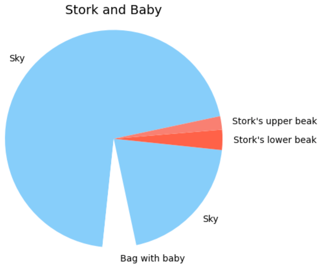
Note: Did you know that 24% of all data analysts originally wanted to become an artist? (Fact-checked by ChatGPT!)
So let’s learn how we create these beauties!
Creating Pie Chart Art in Power BI
Technically, I use Python to generate the pie charts like the one above. But because not everyone is comfortable sharing (and running) Python code, I'm going to show you how to integrate Python-generated pie charts into Power BI.
Along the way, you'll also learn how to create any visual in Power BI using Python. Besides all the fun, this is a really powerful tool to have in your pocket. So at least we still learn something useful.
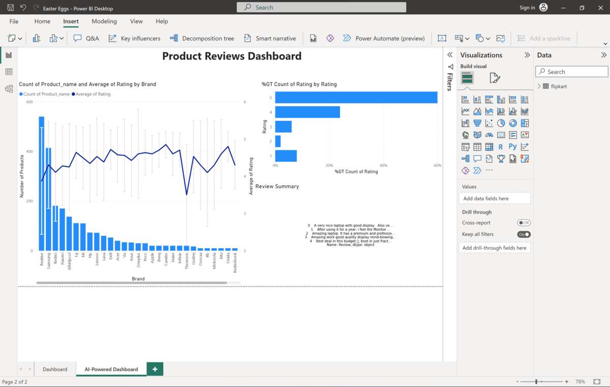
Step 1: Open a report in Power BI Desktop
Open your favorite dashboard where you want to place the pie chart art Easter egg.
I took this product reviews dashboard over here.
It looked so empty anyway.
Step 2: Insert Python Visual
Now, select the Python scripting visual (1) from the Visualizations pane, add it to the report canvas (2), and open the Python script editor (3) as shown below:
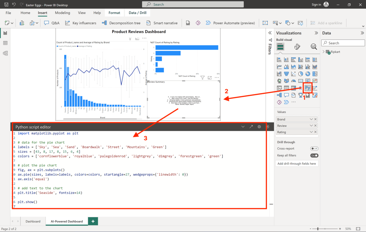
Note: You must have Python installed on your computer and enable Python scripting in Power BI. See this tutorial here for more details.
Step 3: Paste Code
Pick a pie chart you like from the resources below. Paste the code into your Python script editor.
Let’s take the seaside pie chart because the weather outside is so springlike:
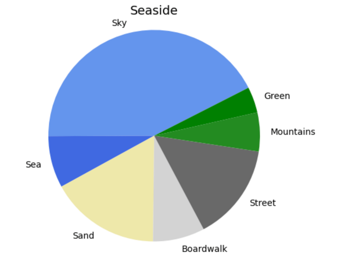
Code (copy and paste this)
import matplotlib.pyplot as plt

# data for the pie chart
labels = ['Sky', 'Sea', 'Sand', 'Boardwalk', 'Street', 'Mountains', 'Green']
sizes = [43, 8, 17, 8, 15, 6, 4]
colors = ['cornflowerblue', 'royalblue', 'palegoldenrod', 'lightgrey', 'dimgrey', 'forestgreen', 'green']

# plot the pie chart
fig, ax = plt.subplots()
ax.pie(sizes, labels=labels, colors=colors, startangle=27, wedgeprops={'linewidth': 0})
ax.axis('equal')

# add text to the chart
plt.title('Seaside', fontsize=14)

plt.show()
Step 4: Share
Voilà - there's your pie chart Easter egg on your dashboard. Ready to share with the world.
It's also a great way to test who's looking at your dashboards and who's not.
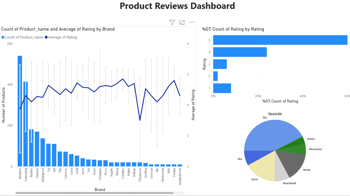
Dashboard with pie chart Easter egg
Note: If you include a Python or R script visual in your report, people who open your PBIX file will be notified that this file contains code that could be harmful. It's a good idea to give your co-workers a heads-up if you're going to use Python or R scripts for the first time. Not just for Easter eggs.
Conclusion
That's it! Congratulations on embedding your first Python script visual in Power BI.
Of course, you can also plug in real data and do more advanced things with it. In fact, embedding Python scripts into your Power BI reports is a powerful tool. Check out this resource if you're interested in learning more.
I'm sure we'll explore more use cases with this tool another time.
Also, check out the pie chart arts in the resources below.
For now, have a great Easter weekend! 🐰
See you next Friday!
Best,
Tobias
Resources
Scroll down to find some more example for pie chart arts along with their corresponding code.
Alternatively, check out this Google Colab notebook which contains all of them.
And yes, ChatGPT helped me create these.
Want the R code instead?
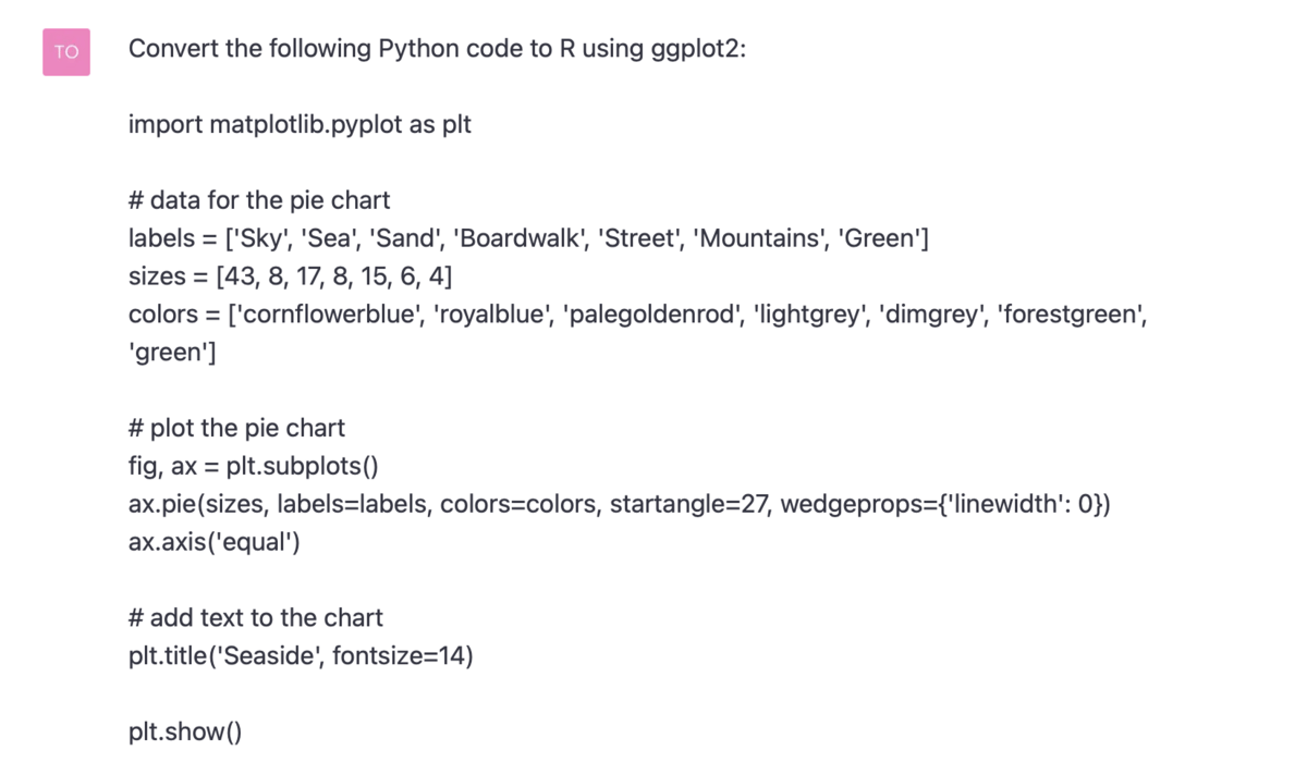
You can use ChatGPT to convert any of these Python script snippets into R code without any problem. For example, when you use the following prompt:
import matplotlib.pyplot as plt
from matplotlib.patches import Circle

# data for the pie chart
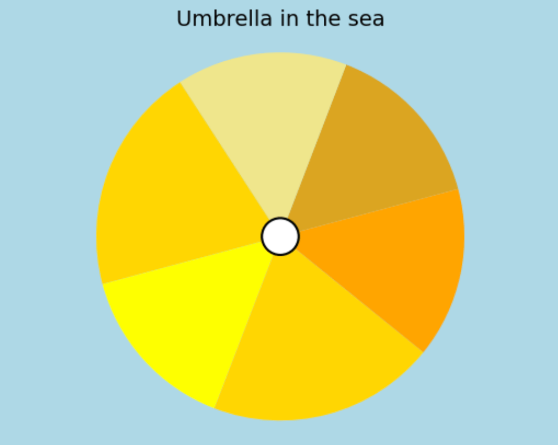
labels = ['Sun', 'Less Sun', 'Sun', 'Sun', 'Sun', 'Sun']
sizes = [15, 15, 20, 15, 20, 15]
colors = ['goldenrod', 'khaki', 'gold', 'yellow', 'gold', 'orange']

# plot the pie chart
fig, ax = plt.subplots()
ax.pie(sizes, colors=colors, startangle=15, wedgeprops={'linewidth': 0})
ax.axis('equal')

# add a circle to the middle of the pie chart
center_circle = Circle((0, 0), 0.1, color='white', ec='black', lw=1.5)
ax.add_artist(center_circle)

# set the background color of the figure
fig.set_facecolor('lightblue')

# add text to the chart
plt.title('Umbrella in the sea', fontsize=14)

plt.show()
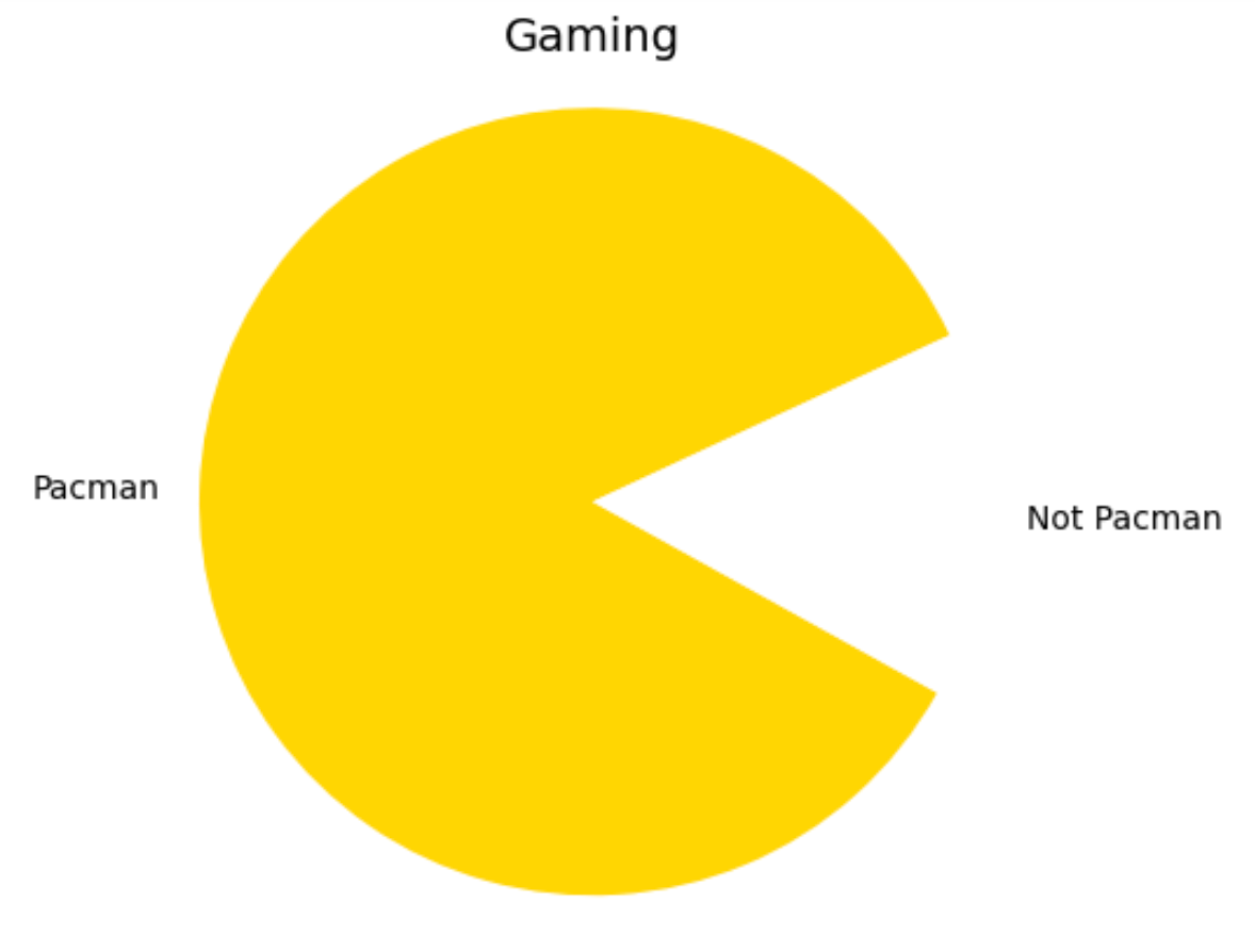
2. Pacman
Retro feeling anyone?
import matplotlib.pyplot as plt

# data for the pie chart
labels = ['Pacman', 'Not Pacman']
sizes = [85, 15]
colors = ['gold', 'white']

# plot the pie chart
fig, ax = plt.subplots()
ax.pie(sizes, labels=labels, colors=colors, startangle=25, wedgeprops={'linewidth': 0})
ax.axis('equal')

# add text to the chart
plt.title('Gaming', fontsize=14)

plt.show()
3. Stork and Baby
Awww how cute!

import matplotlib.pyplot as plt

# data for the pie chart
labels = ['Sky', 'Bag with baby', 'Sky', "Stork's lower beak", "Stork's upper beak"]
sizes = [70, 5, 20, 3, 2]
colors = ['lightskyblue', 'white','lightskyblue', 'tomato', 'salmon']

# plot the pie chart
fig, ax = plt.subplots()
ax.pie(sizes, labels=labels, colors=colors, startangle=12, wedgeprops={'linewidth': 0})
ax.axis('equal')

# add text to the chart
plt.title('Stork and Baby', fontsize=14)

plt.show()
4. Living Room corner
In case you ever wanted to know.
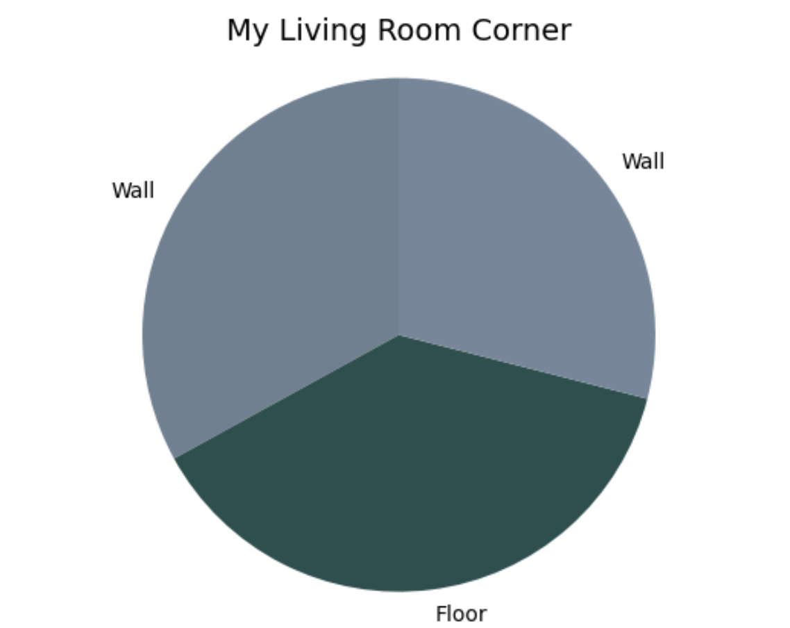
import matplotlib.pyplot as plt

# data for the pie chart
labels = ['Wall', 'Floor', 'Wall']
sizes = [33, 38, 29]
colors = ['slategrey', 'darkslategrey', 'lightslategray']

# plot the pie chart
fig, ax = plt.subplots()
ax.pie(sizes, labels=labels, colors=colors, startangle=90, wedgeprops={'linewidth': 0})
ax.axis('equal')

# add text to the chart
plt.title('My Living Room Corner', fontsize=14)

plt.show()Advanced prompt for few-shot learning in Azure OpenAI Studio
5. Hotel California
Didn’t have a song in your ear yet? You’re welcome!
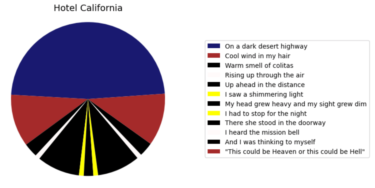
import matplotlib.pyplot as plt

# data for the pie chart
labels = ['On a dark desert highway',
          'Cool wind in my hair',
          'Warm smell of colitas',
          'Rising up through the air',
          'Up ahead in the distance',
          'I saw a shimmering light',
          'My head grew heavy and my sight grew dim',
          'I had to stop for the night',
          'There she stood in the doorway',
          'I heard the mission bell',
          'And I was thinking to myself',
          '"This could be Heaven or this could be Hell"']
sizes = [48, 11, 3, 1, 9, 1, 2, 1, 9, 1, 3, 11]
colors = ['midnightblue',
          'brown',
          'black',
          'snow',
          'black',
          'yellow',
          'black',
          'yellow',
          'black',
          'snow',
          'black',
          'brown']

# plot the pie chart
fig, ax = plt.subplots()
ax.pie(sizes, colors=colors, startangle=4, wedgeprops={'linewidth': 0})
ax.axis('equal')
ax.legend(labels, loc='center left', bbox_to_anchor=(1, 0.5), fontsize=10)


# add text to the chart
plt.title('Hotel California', fontsize=14)

plt.show()
6. Sunset Desert Highway
Mystical.
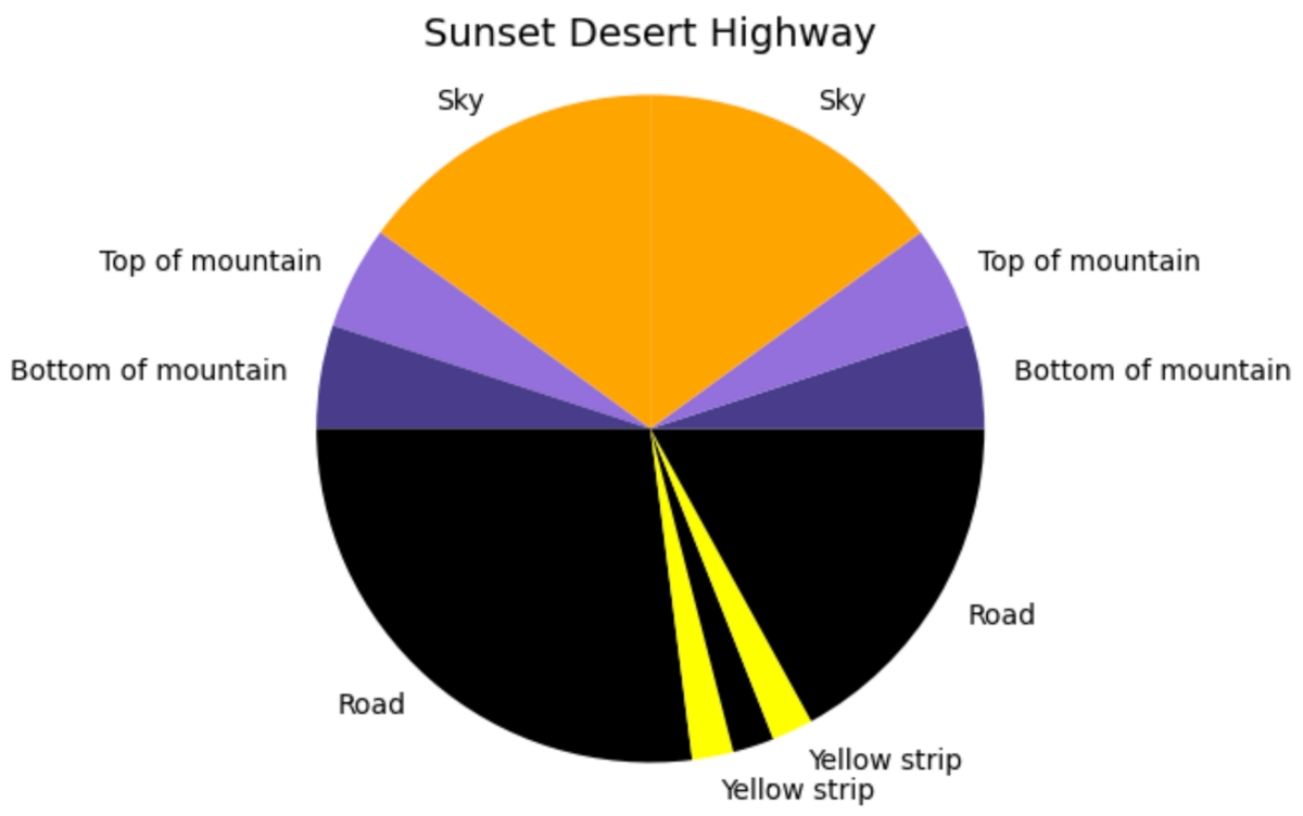
import matplotlib.pyplot as plt

# data for the pie chart
labels = ['Sky', 'Top of mountain', 'Bottom of mountain', 'Road', 'Yellow strip', '.', 'Yellow strip', 'Road', 'Bottom of mountain', 'Top of mountain', 'Sky']
sizes = [15, 5, 5, 27, 2, 2, 2, 17, 5, 5, 15]
colors = ['orange', 'mediumpurple', 'darkslateblue', 'black', 'yellow', 'black', 'yellow', 'black', 'darkslateblue', 'mediumpurple', 'orange']

# plot the pie chart
fig, ax = plt.subplots()
ax.pie(sizes, labels=labels, colors=colors, startangle=90, wedgeprops={'linewidth': 0})
ax.axis('equal')

# add text to the chart
plt.title('Sunset Desert Highway', fontsize=14)

plt.show()
7. Japan
Konnichiwa!
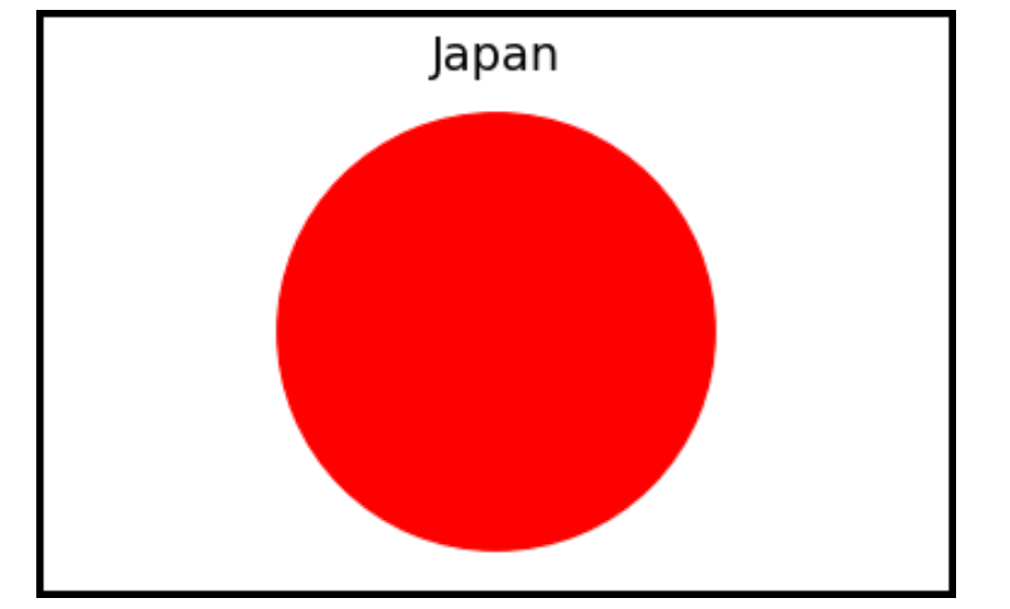
import matplotlib.pyplot as plt

# data for the pie chart
sizes = [100]
colors = ['red'] # red color for Japan flag

# create a figure with rectangular dimensions
fig = plt.figure(figsize=(12, 2), linewidth=4, edgecolor="black")
ax = fig.add_axes([0, 0, 0.3, 1]) # set figure size as a rectangle
ax.pie(sizes, colors=colors, startangle=90)

# set figure properties
ax.axis('equal') # set aspect ratio to 'equal'
plt.axis('off') # remove axis

# add text to the chart
plt.title('Japan', fontsize=14)

plt.show()
8. Seaside
Feels like cruisin’!

import matplotlib.pyplot as plt

# data for the pie chart
labels = ['Sky', 'Sea', 'Sand', 'Boardwalk', 'Street', 'Mountains', 'Green']
sizes = [43, 8, 17, 8, 15, 6, 4]
colors = ['cornflowerblue', 'royalblue', 'palegoldenrod', 'lightgrey', 'dimgrey', 'forestgreen', 'green']

# plot the pie chart
fig, ax = plt.subplots()
ax.pie(sizes, labels=labels, colors=colors, startangle=27, wedgeprops={'linewidth': 0})
ax.axis('equal')

# add text to the chart
plt.title('Seaside', fontsize=14)

plt.show()
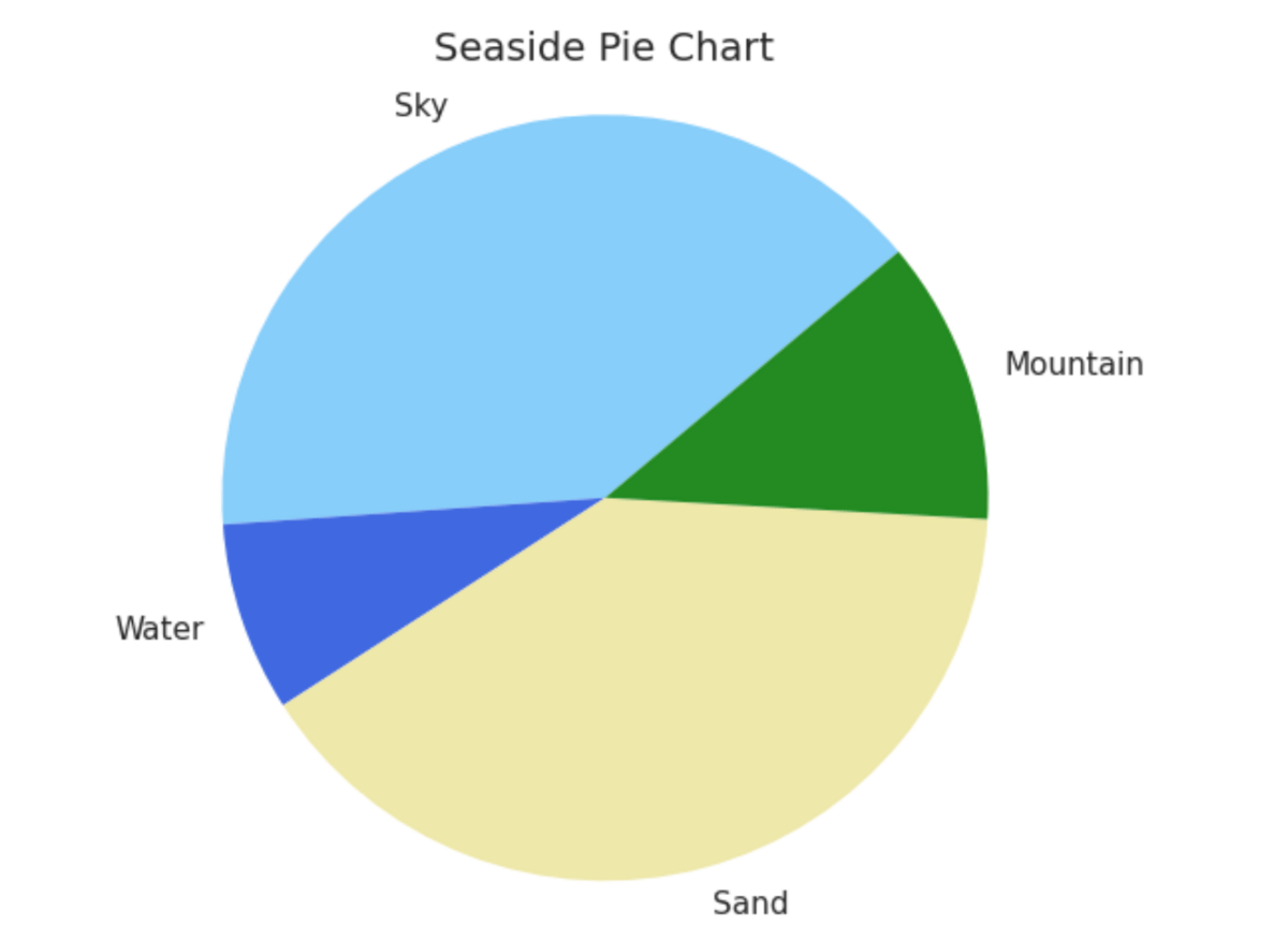
9. Seaside II
The minimalist version.
import matplotlib.pyplot as plt

# data for the pie chart
labels = ['Sky', 'Water', 'Sand', 'Mountain']
sizes = [40, 8, 40, 12]
colors = ['lightskyblue', 'royalblue', 'palegoldenrod', 'forestgreen']

# plot the pie chart
fig, ax = plt.subplots()
ax.pie(sizes, labels=labels, colors=colors, startangle=40, wedgeprops={'linewidth': 0})
ax.axis('equal')

# add text to the chart
plt.title('Seaside Pie Chart', fontsize=14)

plt.show()
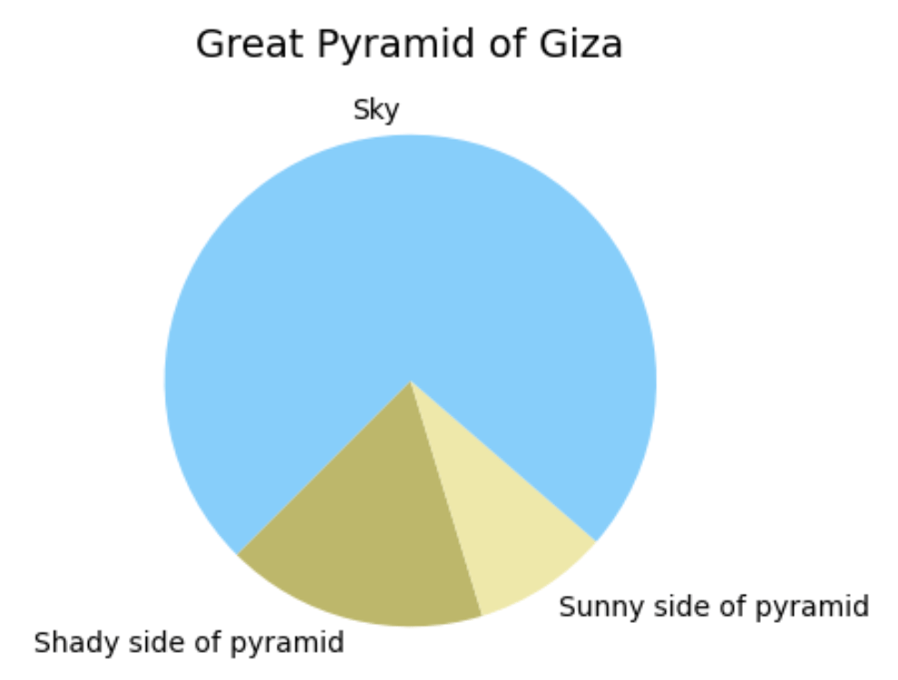
10. Pyramid
It even has the actual dimensions!
import matplotlib.pyplot as plt
import numpy as np

# Use dimensions of the Great Pyramid of Giza
# https://en.wikipedia.org/wiki/Great_Pyramid_of_Giza
h = 146.5 / 230.4 * np.sqrt(2)

def derive_beta_angles(alpha_degrees):
    alpha = alpha_degrees / 180 * np.pi

    x_1 = np.cos(np.pi / 4 - alpha)
    x_2 = np.sin(np.pi / 4 - alpha)

    beta_1 = np.arctan(x_1 / h)
    beta_2 = np.arctan(x_2 / h)

    return [beta_1, beta_2]

fields = ["Shady side of pyramid", "Sunny side of pyramid", "Sky"]
palette_field = {
    "Sky": "lightskyblue",
    "Sunny side of pyramid": "palegoldenrod",
    "Shady side of pyramid": "darkkhaki"
}

alpha_degrees = 30

beta = derive_beta_angles(alpha_degrees)

sizes = [(beta[0] - beta[1]) * 2, beta[1] * 2, 2 * (np.pi - beta[0])]
labels = fields

fig, ax = plt.subplots(figsize=(4, 4))

ax.pie(sizes, labels=labels, colors=[palette_field[x] for x in fields], startangle=(255 - alpha_degrees), wedgeprops={'linewidth': 0})
plt.title('Great Pyramid of Giza', fontsize=14)

plt.show()
Want to learn more? Here are 3 ways I could help:
Read my book: If you want to further improve your AI/ML skills and apply them to real-world use cases, check out my book AI-Powered Business Intelligence (O'Reilly).
Book a meeting: If you want to pick my brain, book a coffee chat with me so we can discuss more details.


