Read time: 6 minutes
Hey there,
Last week's issue was fun. Thanks for your great feedback! It seems everyone has a relationship with airlines.
So guess what? We're sticking with the aviation industry today!
Today we'll analyze flight times and identify critical bottlenecks in the flight schedule.
Again, we use AutoML on Azure - but the same concepts generally apply to other cloud platforms like GCP or AWS as well.
Let's go!
My book AI-Powered Business Intelligence is on sale on Amazon! 🔥Grab your copy now!
Problem Statement
Seems like airlines never run out of analytical problems:
This time, we want to identify bottlenecks in the flight schedule and flag flights that are highly likely to be delayed (one month ahead - before they actually take off).
The BI team came up with a dashboard that tracks a key performance indicator (KPI) of the average difference between scheduled (CRS) and elapsed time:

Currently, the KPI shows that on average, flights were 9.30 minutes ahead of schedule. Makes sense - the schedule is designed to minimize delays.
But: Some flights still had a significant delay (points in red area).
Our key question is:
Can we somehow quantify the expected delay for a flight - even weeks in advance, before the flight actually takes place?
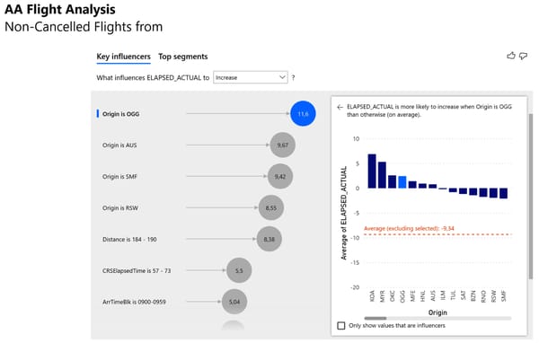
A quick exploratory data analysis (EDA) showed that some variables seem to increase the likelihood of actual elapsed time exceeeding the scheduled elapsed time:

The variables origin airport, flight distance, planned flight duration, and arrival time block seem to have an effect on flight delays.
For example, if you're taking a flight from Kahului Airport (OGG) that's expected to land somehwere between 9:00 and 9:59am, you probably shouldn't schedule a meeting shortly after arrival - the flight will probably arrive with a delay.
How can we deliver these insights at scale?
Let's find out how by taking a look at the solution overview!
Solution Overview
To identify bottlenecks in the flight schedule, we take all the data available when the flight schedule is created, such as departure airport, destination airport, arrival times, etc., and train a ML model on this data to predict the variable 'actual elapsed time'.
Here's what the high-level architecture looks like for this use case:

In the data layer, we have both the historical records about flight schedules and actual elapsed times.
For inference, we use a future flight schedule (e.g. next month) which we load into Power BI in the user layer.
From there, we'll call a ML model hosted on Azure ML Studio in the analysis layer to make predictions about the actual elapsed flight times in our future schedule.
This information will be used to inform the business to highlight bottlenecks in the flight schedule.
Model training with AutoML
If you want to follow allong, download the dataset from the resources below!
Head over to Azure ML Studio. From the start page, choose Create new → Automated ML job:

Choose Create Dataset → From local file. (Yes, you could plug in a SQL server or any other data source here - thanks for asking!)
Give your dataset a name that you can relate to the AutoML training job. (I chose aa-flights-elapsedtime).
Proceed with Next and upload the historical data ('AA_Flights_2021_01.csv' from the resources below).
For the schema, we'll use only the following attributes / data types:
DayOfWeek: String
Origin: String
Dest: String
DepTimeBlk: String
ArrTimeBlk: String
CRSElapsedTime: Decimal (Comma)
ActualElapsedTime: Decimal (Comma)
Distance: Decimal (Comma)
DistanceGroup: String
Now we can create a new experiment for the Auto ML job and choose 'ActualElapsedTime (Decimal)' as the target column.
Select "Regression" since we're trying to predict a continuous numeric target variable and submit the job by hitting Finish!
Feel free to grab a coffee. The entire training will probably take about 30 minutes.
When the AutoML training is complete, you'll probably get a Voting Ensemble or Stacked Ensemble as the best model.
These models are both so-called ensemble models that combine the results of numerous smaller models to either "vote" for the final result or "stack" decisions on top of each other.
They are pretty powerful. In fact, AutoML will often come up with theses in the end.
Evaluate the Model
To inspect the performance of our model, select the best performing model and head over to Metrics.
You will see the RMSE (root mean squared error) of our model along with a little historgram that shows the distribution of the errors.

The RMSE in this case was 12.57 - which is slightly better than a simple regression model that would only predict the actual elapsed time based on the scheduled elapsed time (RMSE 14.3).
So it's actually not that much better considering how much computing power we threw at this problem. Or is it?
Let's find out and see what it does in detail:
Ceck the model "Explanations" tab to find out which factors are influencing our predictions.
When you select the raw features and choose "Aggregated feature importance" you should see the top 5 features of your model as shown in this picture:

As you can see, the five most important features are CRSElapsedTime (no surprise, by far ), but also Distance, Dest, Origin, and ArrTimeBlk.
This makes sense: Larger airports are busier than smaller ones, so the probability of a delay should be higher.
Also, ArrTimeBlk supports what we already found with the exploratory data analysis:
At certain arrival times, especially in the morning hours, airports tend to be busier and delays are more likely.
But what does this mean for individual predictions? Let's look at the Individual feature importance.
I usually choose a couple of random data points to better understand the model:
Points where the predicted value is higher than the actual value
Points where the predicted value almost matches the actual value
Points where the predicted value is much lower than the actual value
From the chart below we can see a comparison of three predictions:

The orange bars represent the feature importance of a data point where the prediction was too low. We can see that the feature CRSElapsedTime was actually weighed down by the model for this case.
For some reason, the model decided that in this special case, the original scheduled time should not be considered as much. Turns out, for this particular flight, this was a bad idea.
In contrast, for a datapoint where the prediction was on target - green bars - the CRSElapsedTime time had a very high importance.
Overall, our model seems to do a pretty solid job:
The most important features are all the same in our random sample
The relative feature importance within an observation is stable (If you look at the orange bar, CRSElapsedTime is still much more important than Distance)
Looking at the individual feature importance helps you explaining your ML model and troubleshooting potential errors.
Although our model isn't much better on average than our regression baseline, it has more variability and therefore allows us to identify individual flights that are likely to have a high delay even weeks in advance.
Let's put the model into production so we can get some predictions from it!
Model Deployment
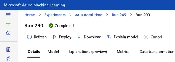
Select the model you want to deploy and click “Deploy → Deploy to web service” from the menu bar:

Deployment is complete when your model is listed under Endpoints and has the status Healthy.
That's it! Let's head over to Power BI to consume our model!
Get Model Predictions Within Power BI
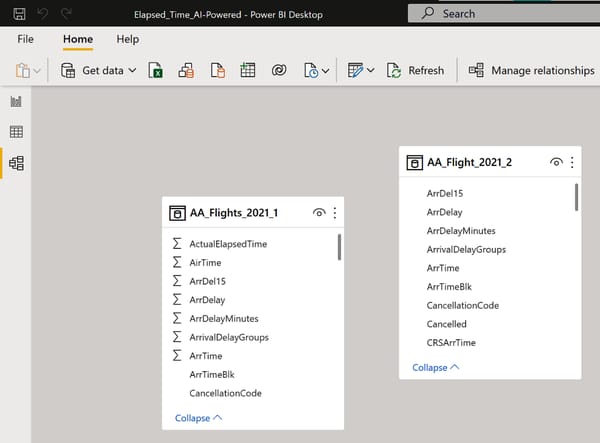
Open Elapsed_Time.pbix (resources below) in Power BI Desktop and take a look at the data model. You will see two data sources:

AA_Flights_2021_1 contains all the historical flights (training data)
AA_Flight_Schedule_2021_2, contains the future flight schedule. That's where we want to get prediction for the 'ActualElapsedTime' attribute
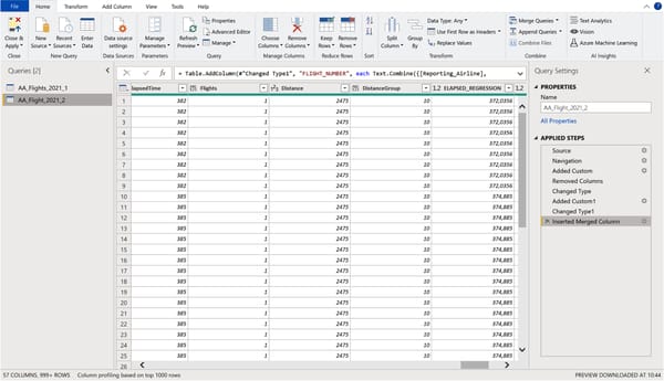
To call our ML model, open the Power Query editor and make sure you select the AA_Flight_Schedule_2021_2 on the left as shown here:

Now choose Run Python script or Run R script, whichever you prefer, and paste the code that sends the data to the model and fetches the predictions (see resources for the script - be sure to update your endpoint URL!).
We're processing more than 10,000 rows of data here - so keep in mind that this could take some seconds.
At the end, you should see the additional column ELAPSED_TIME_PREDICTED.
Hooray! You now have your model predictions in Power BI and we can update our dashboard.
But before you close the Power Query Editor, let’s quickly create a new column that creates the difference between the ML predictions and the CRS scheduled time, so we can later filter for flights according to their expected delay.
Choose Add Column → Custom Column and enter the formula shown below.

That's it!
Choose File → Close & Apply to exit the Power Query Editor and apply your transformations.
Building the Dashboard in Power BI
With our new metric ELAPSED_TIME_PREDICTED, we can now highlight flights based on their expected delay based on the flight schedule.
To visualize this, let’s get rid of the scatterplot and replace it with a treemap which allows more interactivity.
Create the treemap as follows:
Add the fields Origin and Dest to Group.
Put the field PREDICTED_DIFF_AI into Values.
Aggregate PREDICTED_DIFF_AI by Average.
Filter this visual to “PREDICTED_DIFF_AI is greater than 0.”
Make sure drill-down is enabled!
As a result, you should see this:

You can interpret the treemap as follows:
Each field is an origin airport
The field size is the average flight delay from that airport.
Each time we click on a field in this tree, the bar chart on the right is updated to show the flights scheduled from that airport.
For example, if you click on the Honolulu origin airport, you'll see the following:

The tree now shows the available destination airports from Honolulu and the bar chart on the right indicates the flight numbers with their expected delay.
This provides us with a great interactive resource to locate the bottlenecks in our flight planning.
For example, we can clearly see that flights scheduled to depart from Honolulu are on a tough schedule and that the connections from Honolulu to Phoenix, AZ and Chicago O'Hare have the highest chance of exceeding the scheduled time by far - at least to the best of our knowledge so far.
Conclusion
While the model is not perfect, we have improved our baseline, and who knows—maybe we can think of even more criteria that can make the model more accurate.
At least now we have a good showcase to demonstrate how a better AI model could be beneficial for improving our schedule ahead of time.
Feel free to play around with it using the resources provided below.
How did you like today's use case? Any suggestions or comments?
Click on "Reply" and drop me a line!
I'll respond to every email.
See you next Friday!
Resources
This content was adapted from my book AI-Powered Business Intelligence (O’Reilly). You can read it in full detail here: https://www.aipoweredbi.com

