AI is a lot of hype. But there are undoubtedly some areas that were completely turned upside down. Writing marketing copy is one. Coding is another. And then there's data analytics.
The latter is the most misunderstood. People upload their "pretty" Excel spreadsheets into ChatGPT and then wonder why nothing works.
I've been working in the field of AI for analytics over the past 10 years and wrote my book AI-Powered Business Intelligence even before ChatGPT came out. As it turns out, having AI that's effective with analytics all boils down to the data. But not in the way most people think.
So let's find out which secret ingredient really turns ChatGPT into a data analysis helper you actually want to use, not one you need to correct all the time.
Let’s dive in!
How Data Analytics with LLMs Actually Works
As you probably know, the "AI" in ChatGPT really is a Large Language Model (LLM) that was never intended to solve mathematical or analytical problems. They'll confidently tell you that 34.1 × 91.5 equals 3,123.15 when it's actually 3,120.15. But as I explained in my post Making ChatGPT Friends with Numbers, there are 3 strategies to make them good data analysts anyway.
To recap, these strategies are:
1) Write code
2) Use tools
3) Do rankings
Today's post is about strategy 1.
Because data analysis is essentially two things: writing code to crunch the numbers, plus interpreting the results.
When ChatGPT writes code that returns a correlation coefficient or generates an RFM classification, it not only "knows" how to write the code, but also how to interpret these outputs. It can spot outliers, explain statistical significance, and suggest what the patterns might mean for your business, given the context you provide.
This is super powerful. I myself have used ChatGPT countless times to perform data analysis tasks that would have taken me a full week of work in just a couple of hours. Plus, it's even more fun.
But this strategy only really works if we make it easy for the LLM to write that code in the first place. And that happens when your data comes in a "clean" format.
However, most people (especially those without an analytical background) have no clue what "clean" actually means.
Time to fix that.
What "Clean" Data Looks Like
Let's immediately rule out the biggest misconception: When I say "clean" data, I'm not talking about data quality – that's another story entirely. I'm talking about how the data is organized – the shape of it. Data that's orderly, or what statisticians call "tidy" – ready for programmatic analysis.
Now here's where it gets tricky: Most people assume that when their data "looks good" to them it will also be useful for machines. In reality, the opposite is the case. Data that looks good to humans is often terrible for machines.
Think about how you naturally organize information for human consumption:
Nicely formatted Excel reports with merged headers
Color-coded dashboards with visual separators
Summary tables with totals and subtotals mixed in
Pivot table outputs with grand totals
This stuff looks flashy in meetings, but it's absolute poisonous for having LLMs write code against it.
So what does 'clean' actually look like?
There are 2 formats that consistently work:
The 2 Shapes of Data ChatGPT Can Easily Understand
Data that comes in one of the following two shapes is easy to work with for ChatGPT (in-depth example below):
1. Tidy Data
Coined by Hadley Wickham, statistical analysis GOAT and author of the popular book R for Data Science, tidy data follows three simple rules:
Each variable forms a column
Each observation forms a row
Each value has its own cell

Source: R 4 Data Science
Here’s an example of Tidy data:
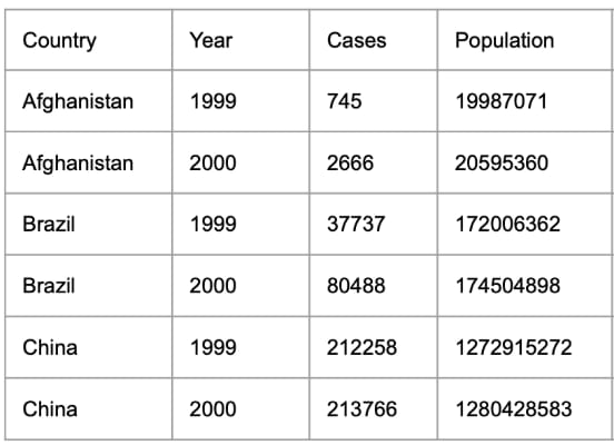
That means: No merged headers. No summary rows mixed in with the data. No fancy formatting. Just clean, consistent structure.
Data which comes in this form becomes super easy to analyze for modern scripting languages like Python.
For example, calculating the Rate (Cases per Population) becomes an easy one-liner:
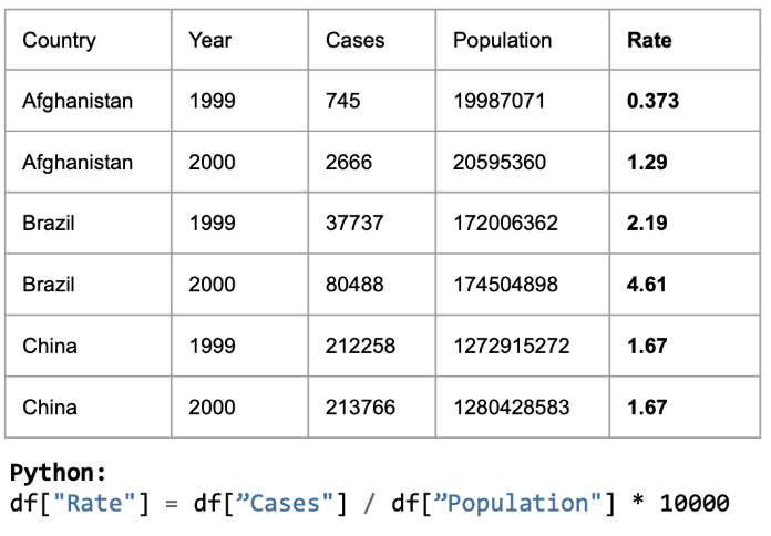
Notice how straightforward this is?
We'll explore another example below. For now, let's look at the second data shape that works.
2. Transactional Data (Logs & Time Series)
Transactional data is often called "raw" data – things that most systems naturally capture during operations:
Web server logs
Sales transactions
User activity events
Time-stamped sensor readings
Here’s an example of transactional data:
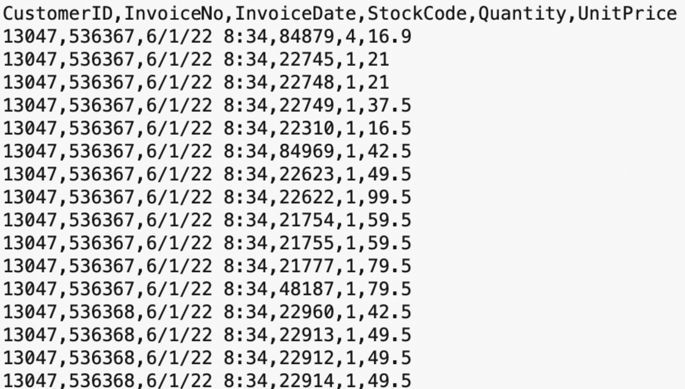
Essentially, each line is a recorded observation or "log". It often comes with a time stamp, but not necessarily. Transactional data typically gets pretty "long", not "wide", which keeps the structure consistent – and makes it super easy to analyze even large datasets in the blink of an eye with one line of code. There’s absolutely 0 problem in uploading a CSV with 100,000+ lines of transactional records to ChatGPT.
In contrast to tidy data, transactional data typically uses encoded identifiers rather than human-readable descriptions. For example, you'll often find IDs or product codes but rarely the full product name or category description.
When to use which:
Transactional data is great for counting things and observing trends over time
Tidy data works better for in-depth, domain-specific reports
Real-World Example
When ChatGPT encounters tidy or transactional data, it can immediately understand the structure and write clean, accurate code. Let me show you a real example that demonstrates the difference.
The Non-Tidy Nightmare
Here's a typical Excel spreadsheet that's pretty for humans, but terrible for machines:

Let's say we want to know: What's the % change of Sales in the B2B product line between Jan 2020 and Jan 2021?
For a human, this is trivial. Just eyeball the data and calculate: Sales grew by 5%.
For ChatGPT, however, there are several problems:
Multiple tables crammed into one spreadsheet
Empty columns and rows for "visual spacing"
Row labels disconnected from the actual data tables
Mixed data and calculated fields
Merged headers everywhere
Color coding that's invisible to the AI (unless you provide screenshots)
When I upload this Excel sheet to ChatGPT and ask about the % change, look what happens:
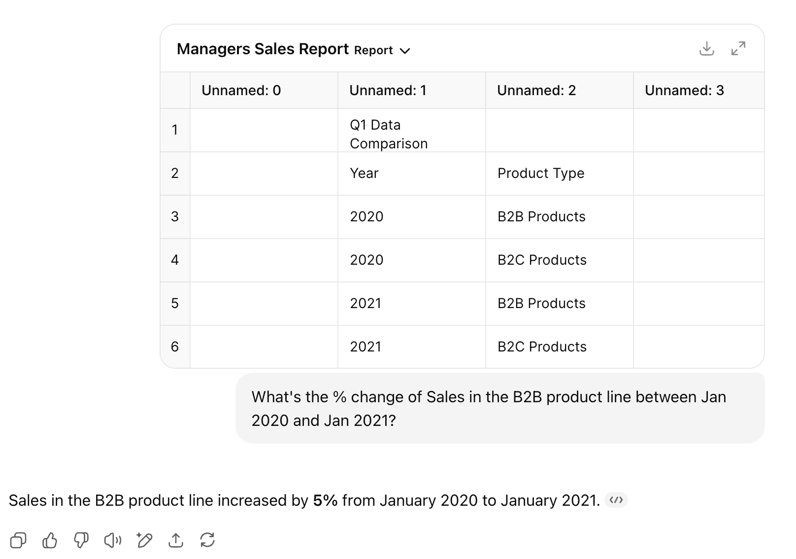
ChatGPT gave me the right answer, but clicking the </> symbol reveals all the code it had to write!
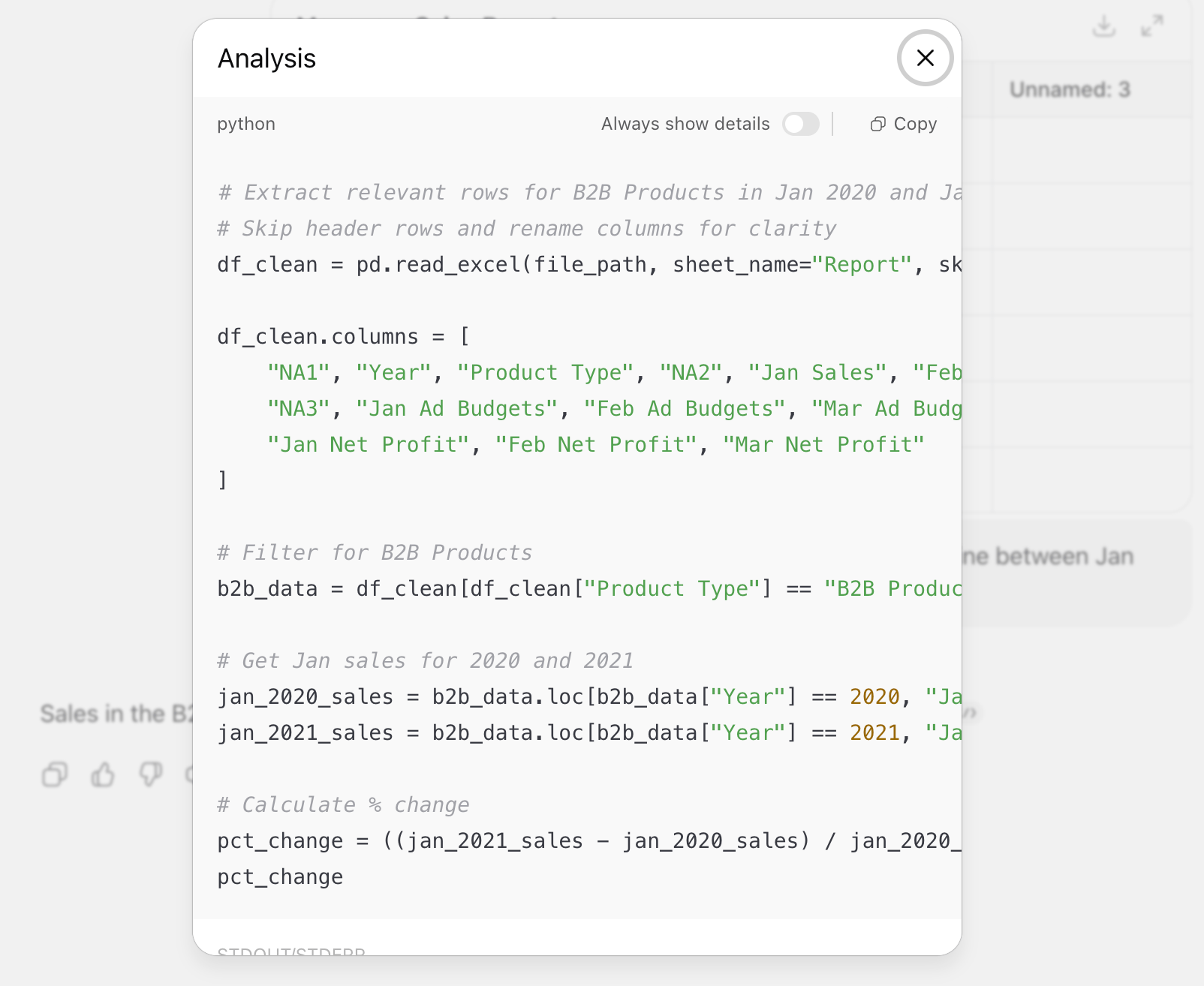
In fact, it had to jump through 4 hoops:
Figure out which rows are relevant
Filter for B2B products only
Extract January sales data
Calculate the percentage change
That's a lot of room for error.
The Tidy Alternative
Here's how our exact same business data looks in tidy format:
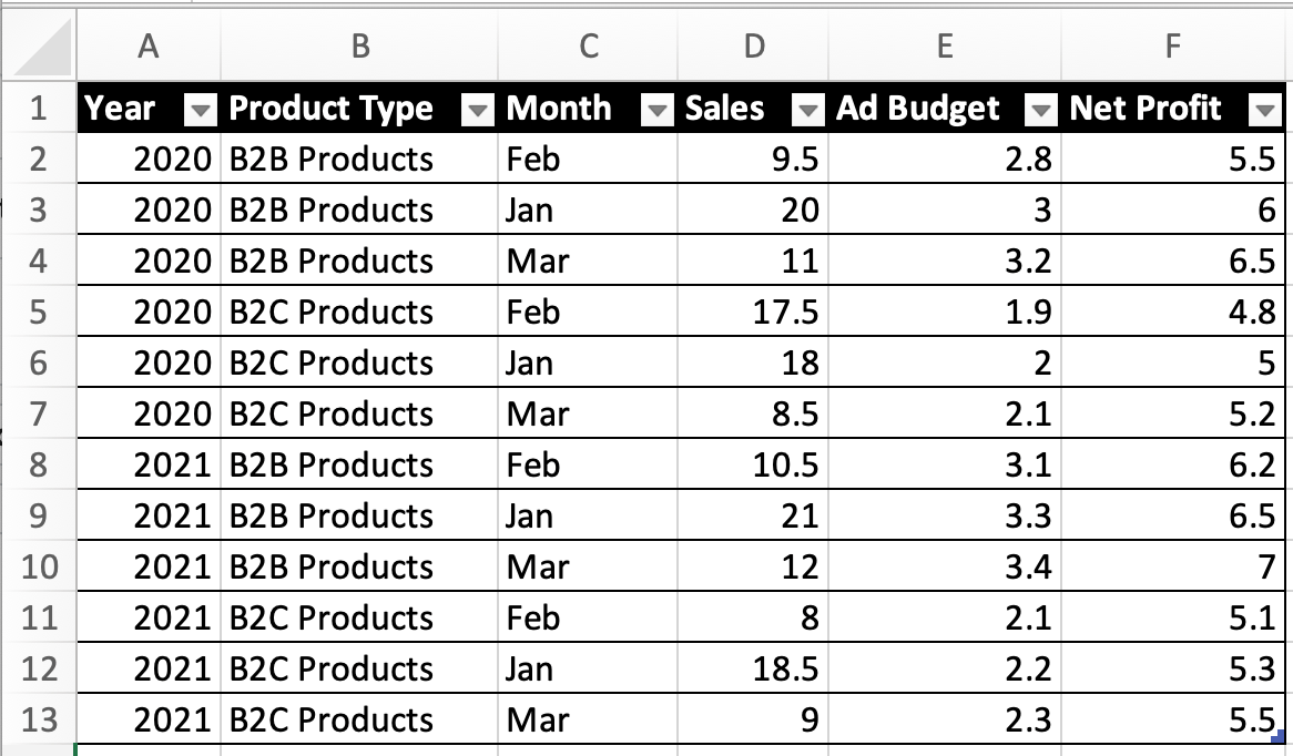
Each observation is in a row, each variable is in a column, and each cell has exactly one value. No formatting, no merged cells.
Let's upload this to ChatGPT and ask the same question:

Now ChatGPT solves it in exactly 2 simple steps:
Filter for B2B products in January for both years
Calculate the percentage change
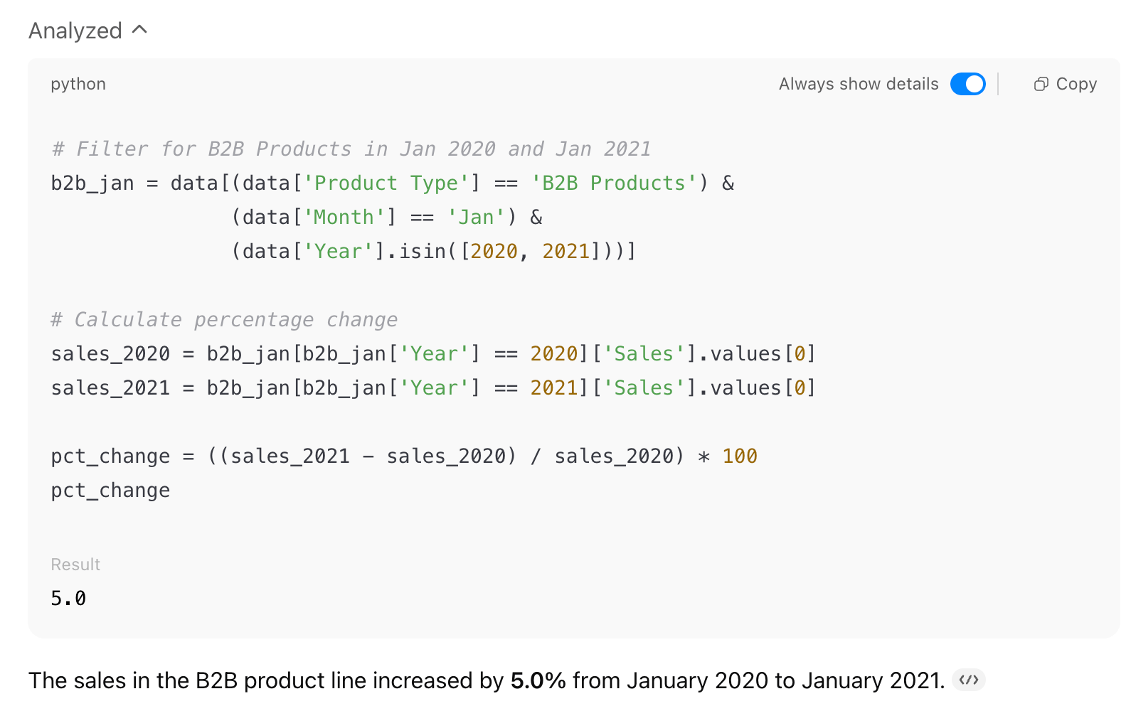
See how much cleaner this is? Even if you don't know Python, you can pretty much understand what's happening.
The Bottom Line
This was just a toy example. As your data complexity grows, the difference becomes exponential. Messy data leads to increasingly complex, error-prone code. Tidy (as well as transactional) data keeps your analysis simple and reliable, no matter how much data you're working with.
Your 5-Step Data Shape Checklist
Here's how to reshape your data for analysis inside ChatGPT:
1. Eliminate Formatting
Remove merged cells
Delete summary rows mixed in with data
Strip out decorative headers and footers
2. Make Every Column a Variable
One piece of information per column
Consistent data types within each column
Clear, descriptive column names
3. Make Every Row an Observation
One record per row
No empty rows as visual separators
No subtotals or grand totals mixed in
4. Normalize Your Values
Use consistent date formats (e.g., YYYY-MM-DD)
Remove currency symbols
Consistent number formatting (e.g., decimal separator)
Tools That Make This Easy
You don't need to be a data engineer to get this right:
Excel/Google Sheets: Use "Paste Special > Values Only" to strip formatting
Power Query: Built into Excel, perfect for reshaping data
ChatGPT itself: Upload (screenshot of) messy data and ask it for steps to "convert this to tidy format"
The Compound Effect
When you get this right, everything changes.
Instead of spending 80% of your time fighting with ChatGPT about basic data parsing, you spend that time on actual analysis. Questions like:
"Which products are trending up this quarter?"
"What's driving the revenue variance between regions?"
"Can you spot any seasonal patterns in our data?"
That’s when the fun begins.
Happy analyzing!
See you next Friday,
Tobias
