Read time: 5 minutes
Hey there,
Today, we'll explore how AI can help us explore data faster and provide a more intuitive and seamless way to interact with large data sets - especially for non-technical users.
In this week's use case, we analyze sales data with the power of natural language!
To do this, we're leveraging the built-in AI capabilities of Power BI - but it also works with a lot of other BI tools as well.
Let's go!
Problem
As a BI analysts, we're tasked with supporting our sales reps and helping them gain insights into sales trends in their respective areas of interest.
In the spirit of self-service BI, we want to provide "help for self-help" and enable sales reps to interact with the data set seamlessly and without technical friction.
Solution Overview
Take a look at the high-level use case architecture:

As you can see in the figure above, the analysis layer is empty. This is because we're not using an external analysis service, but relying on the built-in features of, in this case, Power BI.
These capabilities all take place in the user layer. Other BI tools like Tableau provide similar capabilities, but details may vary.
In any case, choosing a good BI frontend for this task is critical, because you can't build NLP capabilities into BI software that doesn't offer native support (or appropriate add-ons) for it.
Exploring data using natural language is interactive, sometimes even fun. And there's one big advantage:
Most people don't even realize that they've been trained in this method for years (or as long as they've been using internet search engines). Because it essentially feels very similar to finding information on Google.
Here's how it works:
If a business user wants to compare sales figures for a particular country with last year's figures, they might fire off a query like this:
> Show me sales in the USA last year versus this year
With AI-powered natural language capabilities, users can do just that.
Instead of bringing business users together with data analysts to get answers to simple descriptive statistics, it's more efficient for users to ask questions about the data in natural language and have them answered automatically with little or no human assistance.
Let's find out how to do this in Power BI!
Walkthrough
If you want to follow along with this example, then download the Sales & Marketing sample PBIX.pbix file linked in the resources below.
About the dataset
The dataset contains various sales and marketing data from a fictitious manufacturing company. For our case study, let's assume that all manufacturers in this dataset belong to one holding group so that we can analyze the total revenue as a metric of interest. You can learn more about the dataset from the Power BI website.
Build a Q&A report in Power BI
Open the Sales & Marketing sample PBIX.pbix file in Power BI Desktop by choosing File → Open report. (If you're new to Power BI, you might find this resource helpful: Tour the report editor in Power BI.)
In Power BI, the NLP function is called Q&A Visual. It lets you use natural language to explore data in your own words.

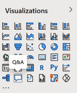
To add a Q&A visual, simply open a blank report page, double-click the Q&A icon and you should see the following screen:

The Q&A Visual consists of four core components:
Text box: This is where users type their questions or queries and where they will see autocomplete and autosuggest features.
Suggested questions: This pre-populated list contains sample questions the user can run with a single click.
Convert icon: This converts the output from the Q&A tool into a standard Power BI visual.
Q&A cog icon: This opens a Settings menu that allows designers to configure the underlying natural language engine.
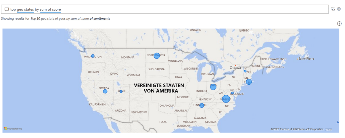
Let’s give this visual a try and select the first suggested question (In my case that's “top geo states by sum of score”, but if Power BI comes up with a different suggestion for you, just follow along with that.)
Power BI responds with the visual it deems most appropriate, in this case a map:

If we don't like the map, we can simply change the visual type by specifying it in the prompt:
> top geo states by sum of score as bar chart

Power BI understands a lot question types, here are some examples:
Ask natural questions: Which sales have the highest revenue?
Relative date filtering: Sales in the last year
Filter by variables: Sales in the US
Filter by conditions: Sales for product Category A or Category B
Show a specific visual: Sales by product as pie chart
...
To make sure the Q&A visual is working well and providing a great user experience, we need to ensure sure three things: Data model, Field synonyms and Suggestions.
Data Model
The data model defines the default relationships and default field names in your dataset. The more explicit and better organized it is, the better for the Q&A experience.

Field synonyms
Use the Q&A cog icon to access the Q&A settings. Here you can update your business glossary and ensure that the search terms your users use are correctly mapped to the appropriate data fields.
For example, we can specify that search terms like total income, total revenue or total sales are all mapped to the data field sum of revenue - if that's the jargon of your users.
In this case, Power BI would display the same results regardless of whether users search for total revenue by region or total sales by region.

Suggest questions
This section in the Q&A settings allows you to edit the questions that are suggested to users by default.

Suggestions are the most powerful vehicle to onboard users on the Q&A tool.
Business users are usually very good at learning by example. Using the suggested questions they should quickly become comfortable replacing things like “region” with “product” or whatever it is that is on their mind.
Here's how the suggested questions would look like in the report front-end:

You can organize the list of suggested questions the way you want. I suggest moving the simplest query to the first position and the most complex one to the last. 3 - 6 suggestions should be a good start.
With the help of the Q&A tool, business users can almost instantly create any visualization they want.
The dashboard below, for example, was built using 4 text queries in less than 60 seconds and without touching any dimensions, measures and filters.

Sales Dashboard
Getting used to this new way of interacting with data might require some time - but you'll be surprised how easy it could be for users to adopt it.
How did you like this week's use case?
Anything else you'd like to see?
Hit reply and let me know!
And see you next Friday!
Resources
This use case was adapted from my book AI-Powered Business Intelligence (O’Reilly). You can read it in full detail here: https://www.aipoweredbi.com

