Read time: 5 minutes
Hey there,
Annotating charts and reports with insights and conclusions can be tedious. Wouldn't it be great if we could automate this process?
That's exactly what we're going to do today with the help of AI and natural language processing!
Natural language features allow us not only to analyze and interpret human language, but also to generate text based on defined inputs.
Today we'll use this technology (with the example of Power BI's Smart Narrative feature) to automatically summarize key findings and highlight trends from our data and charts.
Let's start!
Problem
Suppose we're a BI analyst who wants to add annotations to our reports to help non-technical stakeholders interpret the data and avoid misinterpretations.
We want to clarify the results with crisp summaries, but we don't want to spend a lot of time writing them manually.
Solution Overview
Take a look at the high-level use case architecture:
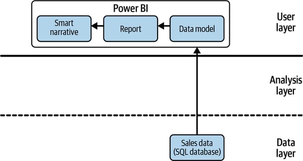
Similar to last week's use case, in this example we only use the built-in features of Power BI. That's why we don't need to call an external AI service in the analysis layer, but can solve everything locally, in the user front-end (user layer).
We'll explore how we can use these automatically generated captions to create a compelling data story that conveys the insights from our graphs in text form.
Here's how a sample auto-generated caption looks like:
Revenue dropped from 622.374.963,84 to 393.703.982,91 during its steepest decline between 2007 and 2014.
Thanks to AI-powered natural language capabilities, these captions automatically adapt to patterns observed in the data and update each time a new filter is applied to the visuals.
Let's find out how to do this in Power BI!
Walkthrough
If you want to follow along with this example, then download the Sales & Marketing sample PBIX.pbix file linked in the resources below.
About the dataset
The dataset contains various sales and marketing data from a fictitious manufacturing company. For our case study, let's assume that all manufacturers in this dataset belong to one holding group so that we can analyze the total revenue as a metric of interest. You can learn more about the dataset from this Power BI website.
Add Smart Narratives to reports in Power BI
Open the Sales & Marketing sample PBIX.pbix file in Power BI Desktop or Power BI Service. (If you're new to Power BI, you might find this resource helpful: Tour the report editor in Power BI.)
Create a new report page and call it Story.
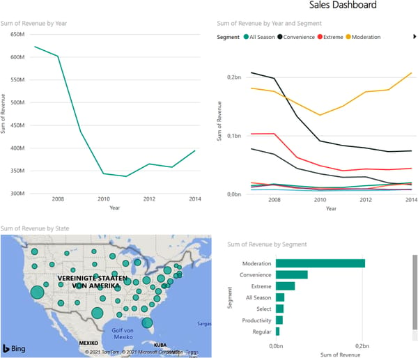
We want to create the following four visualizations:
Revenue by year
Revenue by state
Revenue by segment
Revenue by year and segment
You can use the Q&A tool for this quickly: double-click the Q&A visual from the Visualizations pane, type a query from the above list, and then convert it into a standard visual. Repeat for the remaining queries.
(Do you see how much faster this AI-powered approach is compared to the traditional approach of manually pulling together measures, dimensions and filters?)
Arrange the visuals on the page so that there's some space on the right for the narratives.
Your page should look something like this:
Now open the Visualizations pane and double-click on the the "Smart narrative" icon:
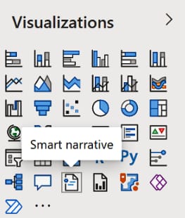
This should add a text box to the right side of your page. (Alternatively, you can drag and drop the visual to the place you like.)
The text box will automatically contain the description that Power BI suggests for all visualizations on the page.
In our case, the description should look similiar to this one:
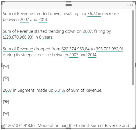
There are some interesting things to note here:
In the first line, you see that Power BI recognized that revenues were trending down and calculated the relative percentages between the beginning and the end of the revenue time series
It also suggests that the product segment Moderation accounted for 52.59% of the total revenue in 2014.
If you find that a statement isn't relevant enough or even redundant, you can simply hide that line from the summary.
You can also examine the calculated values more closely and format them. For example, click on the values used to calculate the revenue figures. In the context menu you can select that this value should be displayed as currency without decimals:
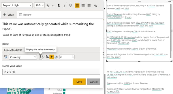
If you format the automatic text output, it becomes more accessible to the reader and looks much nicer overall.
However, when we look at the summary, we notice that there's no information on the regional distribution of sales.
Perhaps this information wasn't important enough for Power BI?
To add custom details, right-click on the map chart showing sales figures by state and select Summarize from the context menu.
Power BI adds another text box that contains descriptions only for the chart you selected. Again, you can delete or change the descriptions as you wish.
Automatic captions are completely dynamic, meaning they'll automatically respond to changes in the underlying data.
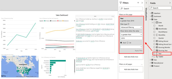
To demonstrate this, add a page filter to our dashboard to show only data from after 2010: Open the Fields pane and then drag and drop the field Year to the “Filters on this page” option pane.
Once you apply the filter, you'll see the contents of the text box change. Power BI recognizes that the sales trend is now going up and updates the corresponding percentage values accordingly.
What is still missing is an explanation for one of the most important charts on this dashboard: the revenue breakdown by segment.
You can clearly see that the segment Moderation is the only segment with a relevant positive trend-this is something that should be easy to recognize by the smart narrative tool, shouldn't it?
Right-click the plot and click Summarize. But what happens? Power BI responds with only a single line of rather cryptic text.
We have just hit the boundaries of the smart narrative feature.
Currently, it's not possible to summarize charts with many different categories or underlying trends.
Also, summaries cannot be created for visuals that contain on-the-fly calculations like complex measures or custom percentages.
Since the Smart Narrative feature was initially released only in 2021 and rolled out gradually in 2022, it'll be exciting to see which of these restrictions will disappear. You can find more details about the Smart Narrative tool (and its limitations) in the Microsoft resource documentation.
For now, let’s just add the final conclusion for our dashboard by hand.
Add a new line to the last text box and type:
Conclusion: Sales from product segment Moderation were the main reason for the positive revenue trend between 2011 and 2014
Your final sales dashboard should look similar to this:

We could now easily export this page to a PDF (File → Export → Export to PDF) or publish it to a Power BI server. For more publishing options I recommend the article “Ways to Collaborate and Share in Power BI” if you want to get started on this topic.
Now it's up to you!
Feel free to recreate the example above using Power BI and the sample dashboard linked in the resources below.
By the way, if you want to check how this works in Tableau, start here.
Thanks so much for reading! Did you enjoy today's quick demonstration?
Any other use cases you're interested in?
Drop me a reply and let me know!
See you again next Friday!
Resources
This use case was adapted from my book AI-Powered Business Intelligence (O’Reilly). You can read it in full detail here: https://www.aipoweredbi.com

