Read time: 6 minutes
Hey there,
Today you'll learn how to combine multiple AI/ML services to make life easier for your BI users
You'll see that different AI services aren't an either/or decision, but can complement each other.
This issue is meant to inspire you to combine different AI services to develop even more powerful use cases.
Let's go!
Want to build a winning data & AI roadmap for your own business? Join my upcoming live cohort "Nailing Your AI Use Case Roadmap"!
Not sure? Book a free 1:1 call with me here!
Problem Statement
Imagine we are part of the data analytics team of a telecommunications provider.
Marketing & Sales has approached us to look into the topic of customer churn.
As per the business’ definition, churn happens at the moment a customer cancels their contract, no matter the remaining duration of the contract (the business is offering monthly and 24-month contracts).
The business is currently facing the following challenges:
Churn rates are difficult to interpret as they seem to go up and down sporadically.
To prevent churn, making counteroffers has proven to be effective, but costly. Stakeholders want to know which customers are most lucrative to target with such offers.
Regular customer surveys include open-text feedback that is likely to provide important signals for churn modeling.
The business wants interactivity to comb through the data in order to get a feeling for what’s happening.
The data analytics team is expected to identify viable ways to present this information — of course, as soon as possible and with heavy budget constraints.
Solution Overview
Take a look at the use case architecture below:
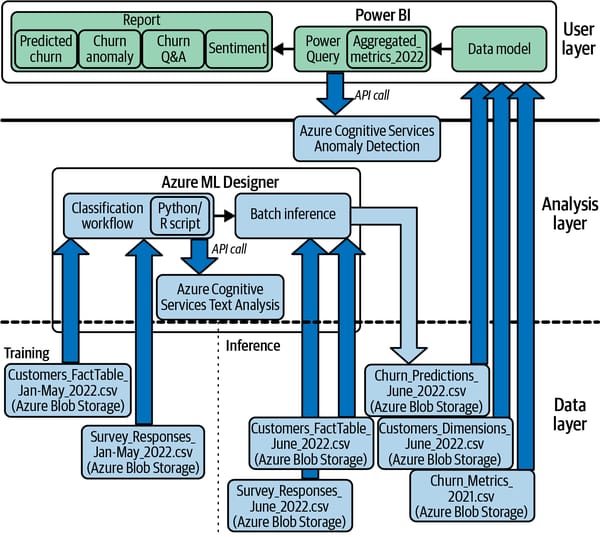
As you can see right away, this is the most complex use case we've covered so far.
But relax - we'll stay high-level and tackle it piece by piece.
Let’s start at the top with the User layer:
Ultimately, we want to have a Power BI dashboard that allows us to do the following:
Understand where churn happened and let users interact with historical data. We will use the Power BI Q&A visual for this.
Understand churn fluctuations and know which one should be flagged as “too high.” We will use anomaly detection for that.
Predict customer churn to understand what revenue is at risk in which segments. This will be realized using no-code ML.
Include customer feedback to understand what customers are complaining about. We'll rely on a text analytics service for that.
Now let’s jump to the bottom and examine the Data layer for this use case.
Power BI will be fed by these data sources:
Churn_Metrics_2021.csv: Contains aggregated historical information about customer churn
Churn_Predictions_June_2022.csv contains the most recent customer data with respective churn predictions.
Customer_Dimensions_June_2022.csv contains demographic information about customers for further explorations or drill-downs.
Normally, we would fetch this data from database, but to keep things simple here let's say we're working with CSV files on Azure Blob Storage.
Let’s head over to the Analysis layer. Here's whats going on:
We'll train a ML model in Azure ML Designer (no-code platform) based on the information from the customer fact tables and text sentiments from user surveys.
To to get the sentiment scores, we'll run Azure Cognitive Service Text Analytics on the customer feedback.
The model predictions will be stored as Churn_Predictions_June_2022.csv in Azure Blob Storage (batch prediction)
Training the Churn Prediction Model
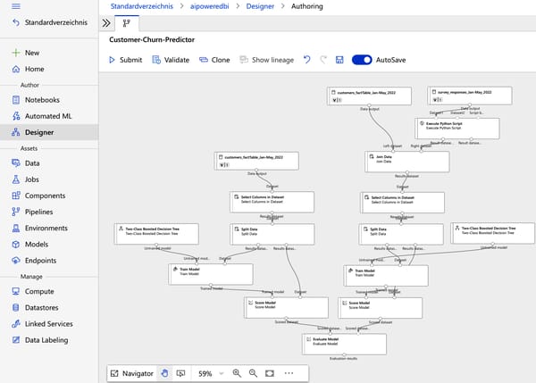
To train the churn prediction model, we create a custom ML workflow in Azure ML Designer.
We use various customer attributes such as tenure, contract type, monthly charges and also sentiment scores from survey responses (if available). Calling the sentiment analysis service is done directly from this workflow.
We won't cover the workflow in detail here. If you want to read about it, check Chapter 10 of my book.
Building the Dashboard in Power BI
(Download the Customer_Analytics_AI-Powered.pbix from the resources below if you want to follow along.)
Here's how our data model in Power BI looks like:
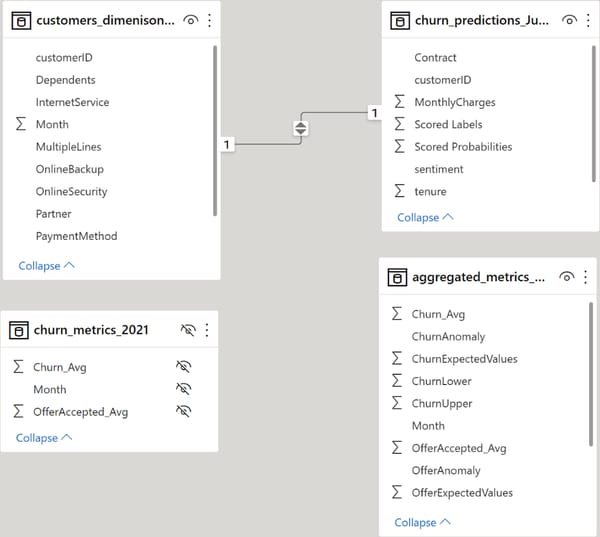
There's one additional table called Aggregated_metrics_2022. This table is generated in Power BI by taking the dataset churn_metrics_2021 and adding the predicted churn rate for June 2022.
Power Query will then take this time series and send it to Azure Anomaly Detection to infer the expected lower and upper bounds for the metrics and set a flag for anomalies found.
With this data model, we can generate a dashboard that looks like this:
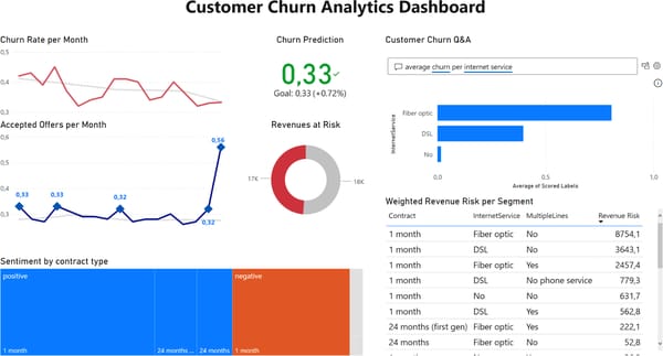
Let’s unpack the various components.
Anomaly Detection
How it works:
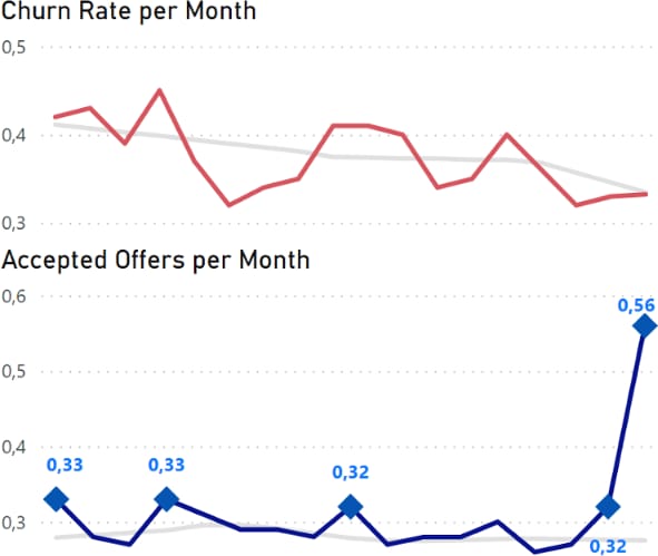
Two line charts show the churn rate and offer acceptance rate by month.
The light gray lines represent the expected value of the respective metrics
Data points that show an abnormal positive spike are highlighted with markers
What it means:
We can see that the overall trend for churn seems to be negative (good!), and we couldn't find a clear outlier, although the line seems to be quite fluctuating.
For the offers, we can clearly see that the high spike last month was recognized as an anomaly, but so were a few data points before that. The overall trend seems to be fairly consistent.
How AI/ML is involved:
We use Azure Anomaly Detection AI Service to generate the markers.
Predicting Churn
How it works:
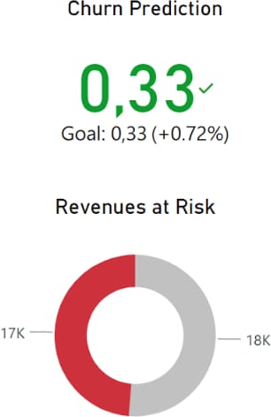
ML predictions show the expected customer churn rate for the current month and how much revenue is at risk.
The KPI is calculated based on individual customer churn probabilities. This KPI is compared to a target (here 33%).
The donut chart called "Revenue at risk" sums up all the revenues of the current month from customers marked with a churn flag = 1.
What it means:
The visual shows that the churn goal (33%) is probably still reached this month - even though very close.
The "Revenue at risk" metric gives the business a simple overview of what's at stake. We could even improve this and account for customer lifetime values, but right now it's just the current revenue.
The core idea here is that we can blend AI predictions with historical or transactional BI data to make the predictions more relevant for the business.
We will see another, more detailed example of this in the next component.
How AI/ML is involved:
We use AutoML to train the ML model.
Churn Q&A and Revenue Table
How it works:
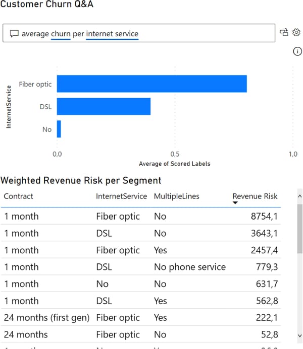
The Q&A tool lets users query data using natural language across many dimensions because we set the relationship between predicted churn outcomes and dimensional BI data in the data model.
The table shows a combination of historic BI data and AI predictions where the new field Revenue Risk was generated in Power BI as a quick measure that multiplies a customer’s monthly revenue with their individual churn probabilities.
By aggregating revenue risk across different customer groups, we can easily identify the customer segments where most money is lost, providing actionable insights for sales and marketing.
What it means:
In the example above, the user queried “Average churn per internet service” and saw that the fiber optics segment has a much higher churn rate than other categories.
Exploring this further, we can see that customers who are on a monthly contract with fiber optics internet service and without multiple lines provide the biggest leverage to defend revenue, with a revenue risk of $8,754 per month.
If marketing was to think about personalized counterchurn offers, this should be an interesting category to look further into.
How AI/ML is involved:
Natural Lanugage Processing allows us to run the Q&A queries.
Survey Data

How it works:
The sentiment analysis of the unstructured data eventually became part of the churn prediction model, but it can also stand alone to provide further insights.
The treemap visual contrasts the sentiment labels to any customer dimension - in this case, contract type.
What it means:
From this visual, we can see that most customers actually gave positive feedback, while the majority of all customers who provided negative feedback were on a monthly plan.
Considering the high churn likelihood of customers in the monthly category, it should be the first priority to examine what’s fundamentally going wrong here.
How AI/ML is involved:
We use Azure Cognitive Services for Text Analytics to turn raw text into numeric sentiment scores
Conclusion
With this dashboard, we can give marketers and salespeople a customer-centric tool that uses AI under the hood, not to show off, but with one goal in mind: to make data more actionable and meaningful for business stakeholders.
Choosing AI services isn't an either/or decision, but can bring great benefits when they are combined.
However, don't let technology pull you down a rabbit hole where the functionality of BI is overloaded with AI components.
Remember that each AI service adds another layer of complexity: After all, someone has to take care of the models, the Q&A tools, the data integration, and so on.
On the other hand, with off-the-shelf AI services, you can quickly verify whether business users find these features useful.
Try it out yourself, by opening the Power BI file from the resources below and playing around with the components therein.
What information would you add, change, or delete altogether?
I hope you enjoyed today's issue.
See you next Friday!
Resources
This content was adapted from my book AI-Powered Business Intelligence (O’Reilly). You can read it in full detail here: https://www.aipoweredbi.com
