Read time: 4 minutes
Hey there,
Being able to slice and dice your data to get the insights you want was the great promise of self-service BI. In reality, however, this process turned out to be quite tedious and cumbersome.
Today, you'll learn how you can use AI to guide your data deep dives and get the insights you want faster.
In this example, we continue our case study from last week. Also, this is the last use case for a while where we showcase the features of Power BI - stay tuned for something new next week!
Let's start!
If you like this content, check out my book AI-Powered Business Intelligence for a more detailed walkthrough of today's use case and many more!
Problem
We continue working on the problem from last week. After setting up the Key Influencer Tool to find out what happened to sales in Phase A, today we want to find out what factors explain the slow sales recovery between 2010 and 2014 (Phase B):

Our goal is to provide key insights to the sales department and, ideally, a dashboard to help them explore the data themselves.
Solution Overview
Take a look at the high-level use case architecture:

For this use case, we use the Decomposition Tree feature in Power BI. Other than that, the architecture of our use case looks exactly like the one from last week.
The decomposition tree is a great tool for performing root cause analysis. You can use it as an intelligent drilldown, as Power BI will automatically suggest the next drilldown level based on a specific metric you want to investigate.
So without further ado, let's get started in Power BI!
Walkthrough
If you haven't already download the Sales & Marketing sample PBIX.pbix file linked in the resources below.
About the dataset
The dataset contains various sales and marketing data from a fictitious manufacturing company. For our case study, let's assume that all manufacturers in this dataset belong to one holding group so that we can analyze the total revenue as a metric of interest. You can learn more about the dataset from this Power BI website.
Performing AI-Assisted Deep-Dives
Start with a blank report page in your Power BI file.
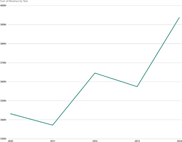
Create the Revenue by Year chart again, this time for the period from 2010 to 2014.
Convert this chart to a static chart if you used the Q&A tool for this. The revenue chart should now look like this:
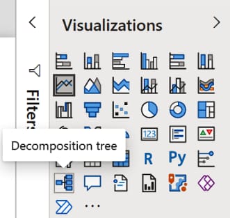
Select this chart and change the visualization type to "Decomposition tree" as shown here:
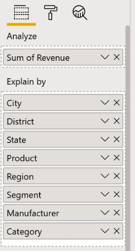
Similar to working with the key influencers tool, we have to tell Power BI which variable we want to analyze and which dimensions we consider explanatory factors.
Modify the visual properties so that they look like this:
The initial output of the decomposition tree is a simple summary of the metric we're interested in:

The task now is to break this aggregate metric into smaller parts, ideally so that we capture the most important metrics at the top of the tree.
If you click on the small + icon to the right of the aggregated revenue, a menu will open where you can select the next split you want to make.
You can either select the split manually (based on your own preference) or use a feature called AI splits.
AI splits are indicated by small light bulbs and automatically select the next best drilldown level for you, depending on whether you want to influence your top-level metric higher or lower, as you can see here:
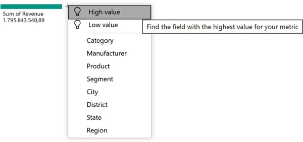
Since we're interested in explaining the revenue growth in Phase B, we choose an AI split for high values.
Power BI creates the first split based on the Category variable:

If you hover over the light bulb next to the Category split, you will see a Power BI tooltip explaining the current node of the tree.
In this case, this first split tells you that the revenue between 2010 and 2014 was highest when the Category was Urban:

You can now drill down as much as you want - for example, to find out what criteria led to the revenue growth in the Urban category.
Again, we can manually select the next drilldown level or let Power BI figure it out for us, depending on whether we're interested in high or low values. If you choose “High value” again, you’ll see that the next split will be made on the field Manufacturer:
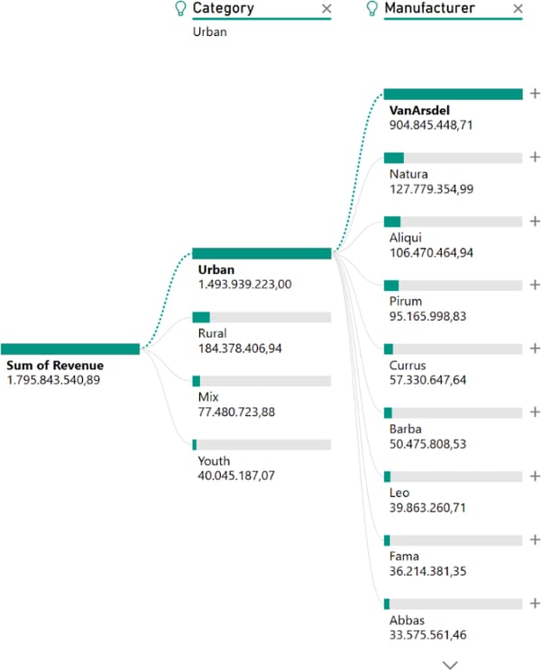
At this point, let's pause for a moment and briefly recap why exactly we see these splits in this order. Why is the data not divided first by manufacturer and only then by category? After all, we've seen last week that the manufacturer VanArsdel claims the largest share of the revenue.
This happens because the underlying algorithm in Power BI that makes the splits, is greedy. It chooses to drill down to the next category at the point where the splits provide the biggest advantage.
To illustrate this phenomenon, let's look at a comparison of Revenue by Category vs. Revenue by Manufacturer:
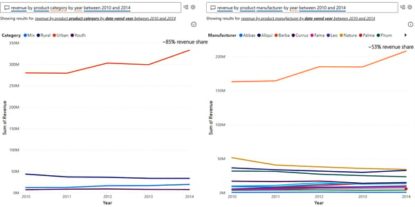
You can clearly see that both Urban and VanArsdel stand out as major revenue generators in their classes.
However, if you look closer, you'll notice that Urban claims about 85% of the revenue and VanArsdel only 53%. That's because we've many more manufacturers than categories, taking away a lot of small shares from the leading key driver in this field.
That's why Power BI splits the data by Category first and by Manufacturer second.
While this greedy approach works quite well most of the time, in some cases you need to be careful:
If you examine data by a particular split, you can only analyze the data that actually exist in that split.
For example, if you first split by Category and then examine the Urban category, you'll only see manufacturers that actually make products in the Urban category. If a manufacturer in the dataset did not produce any goods for the Urban category, it wouldn't show up in the downstream splits of that tree branch.
Conversely, this means that Power BI would most likely never (or only at the very end of the tree) suggest splitting based on a field where all observations are equally distributed.
Going back to our decomposition tree example, let's add two more AI splits for high values and you should see this result:

If you look at this tree, you can immediately see that sales:
of the Urban category,
from the manufacturer VanArsdel
within the Moderation segment and
in the Eastern region
were the main contributor to revenue growth during 2010-2014.
If you create a line chart with just these filter criteria and compare it to total sales, you can clearly see how this trend plays out:
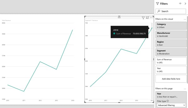
Sales from this segment alone contributed more than $20 million to our overall revenue growth and grew even stronger on a relative level (+46%) than absolute revenue growth (+15%).
With the decomposition tree, business users can easily interact with their data and find the relevant contributors at the level of granularity they need.
Once the data has been automatically sifted through using Power BI 's AI capabilities, it's much easier to loop in a data analyst as needed to review their conclusions or ask questions that came up during the analysis process.
Now it's up to you!
Feel free to comb through the data on your own using the resources provided below. Is there another trend you can identify?
And with that, we conclude our last Power BI use case for a while.
Stay tuned for a new AI use case next week.
Anything particular you'd like to see?
Hit reply and let me know!
See you again next Friday!
Resources
This use case was adapted from my book AI-Powered Business Intelligence (O’Reilly). You can read it in full detail here: https://www.aipoweredbi.com
